HOME: Phantom Ranch
BRANDING

Overview
Phantom Ranch is a non-profit camp in Wisconsin devoted to providing great camp experiences year round. They provide a variety of camps as well as team building, outdoor education, horsemanship programs and more. The overnight camps have a customized brand to make each summer unique. 2021’s theme was HOME. I collaborated with Phantom Ranch to develop a visual identity that resonated with this theme and integrate with the broader camp experience.
YEAR: 2021
ROLE: Branding
The Problem
The summer theme, HOME, needed a unique visual identity to help create a memorable experience and provide a fun and engaging framework for camp activities. The visual identity needed to resonate with campers while also fitting into the larger camp identity.
The Goals
Create an inclusive representation of the theme “HOME” and provide visuals that complement
Scale the visual identity to the multiple pieces of summer camp materials and merchandise.
Process
Developing the visual identity for the "HOME" theme presented a unique challenge: it needed to resonate with the camp environment while avoiding specific representations of home. This ensured inclusivity and made sure that all campers, regardless of their backgrounds, could relate to the theme. Additionally, as the primary expression of the theme would be a T-shirt worn by campers aged 10-18, the design needed to appeal to this diverse age group.
Finding the Direction
In order to find the direction of design, several conversations with camp staff were had about the theme and what it meant to them. During one conversation, a staff member had described Phantom Ranch as a “home away from home.” This was the phrase that unlocked a new perspective for me. The camp experience in itself embodies feelings of HOME for every camper each summer. Capturing camp as a “home away from home” became the guiding principle.
Brainstorming and Ideation
Photos and imagery from the camp were collected to serve as direct references for the visual identity. Since cabins were the most direct representation of the temporary “Home” campers would experience at camp, they served as the focal point for the theme. Several sketches and compositions were created before the final art was approved by camp staff.


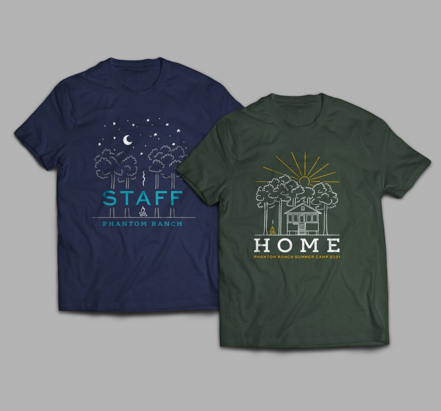
Result
The visual identity for the HOME theme uses an line drawing of a cabin at camp with a slab serif typography. This style helps communicate nostalgia and comfort. Since it starts as an artwork designed for a T-shirt, the artwork was designed with two colors in mind. Green was chosen as the main theme color to help make the illustration feel more natural to its context. The yellow was used to highlight features and create contrast.
The visual identity was scaled to different branded items like camper workbooks and posters hung around camp. It was important to make sure that each piece felt consistent with the visual identity, driving the theme of HOME everywhere at camp.